CASE STUDY 03
GrandPad iOS & Android Apps
Companion apps for the GrandPad tablet
The Problem
As a complement to the tablet for seniors, GrandPad provided mobile apps for family members to communicate and share photos with the tablet user. Essentially, they were social media apps meant to privately communicate with family. The iOS and Android companion apps were both functional but were in dire need of a more cohesive user experience between both platforms. And they honestly needed a fresh coat of paint to match with the newer website and checkout process UI. The Android app had also fallen behind in terms of features, so it was time to bring it up to speed.
The Goal of the Redesign
The iOS redesign came first, so it was going to set the direction for the Android redesign. These were my priorities for both apps:
- Leverage OS design guidelines to create cohesive experiences. The current apps didn't follow the HIG or Material Design specs but also weren't consistent with themselves. There wasn't enough time allotted to build out a single design system to translate across both iOS and Android, and staying closer to the HIG and Material specs would help users feel more comfortable using the app on the respective platforms.
- Organize the photo comments better. Comments on photos came in either text or audio format from the GrandPad tablet, and the UI needed a clearer differentiation for voice comments.
- Add a notification center. There was no place to see past notifications within the app, so it was a priority to add a place where users could see all new and past notifications.
The iOS & Android Apps
Disclaimer: The design of the bottom tabs with an action button over it ended up getting axed towards the end of the iOS development. The shipped version has a standard bottom navigation with a "New Post" button in the middle position.
Signup and Login
 After users were invited to the private family network, they could set up an account from within the app and choose a profile photo.
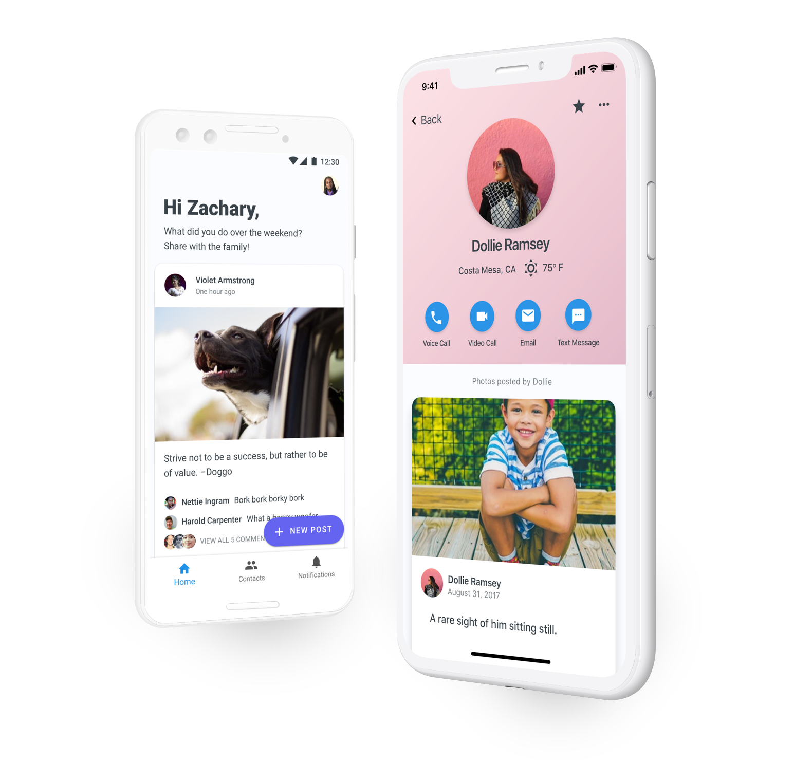
Home/Photo Feed
 This was the most-used section of the app. Any photo that had been shared, from a GrandPad tablet or a companion app, would show up in the feeds of the entire family. We allowed for hiding posts from individual contacts because sometimes family dynamics are complicated.
Contacts
 Each contact in the family network had a dedicated screen to contact them and to show all the photos they had shared. Through user feedback we learned that being able to see the local weather for contacts was a much-loved feature, so it stayed in the redesign.
Post View
 Voice comments in the post view got a much-needed upgrade. The ability to play and pause was added, and we now showed the length of the voice comment so users knew how long they would need to listen for.
I added a bar with a small post preview that expanded down as users scrolled through comments, to provide context as to what photo was being commented on. This was mainly helpful in the case when a user was sent to a comment from a notification. Sometimes the comment wasn't at the top of the list, and for simplicity's sake we wanted to send users to the comment list on the photo screen instead of a dedicated screen for comments.
 For commenting on a post, we included a text box that expanded as you typed multiple lines. This way we could support showing more than one line of the comment being typed, and users could quickly review their comment before posting it.
Each post had a dedicated photo-only view that provided more of a photo gallery type of view.
New Post
 On Android, we used the Floating Action Button component to provide a quick way to choose where between photo sources when making a new post.
In a following update, we allowed users to add more than one photo to a post. The screen on the right allowed users to see an overview of all the photos that were being posted and write one caption for the post.
Notification Center
 A central place to see all notifications was finally added to the app. This screen also allowed users to manage notifications by marking them as seen with a swipe.
Video Call
 Another much-used feature of GrandPad's platform was video calling. The platform supported video calls between GrandPad tablets and companion apps in any configuration.
Results
Both projects successfully launched and are live on the App Store and Google Play Store. You can see the listings here:
App Store
Play Store