CASE STUDY 05
GrandPad Checkout
Redesigning the buy flow for a GrandPad tablet
The Problem
The user bounce-rate was 99.8% for the first page of GrandPad's buy flow, whether coming from a point in the sales funnel or landing directly on the page. Mobile devices were starting to account for a large percentage of our visitors, and none of the buy flow was optimized for mobile. To add some spice to this project, GrandPad had recently started working with a marketing firm, and our biggest marketing campaign was scheduled to launch in a little over a month. This created somewhat of a crunched timeline.
The Goal of the Redesign
The main goal of this redesign was to improve the bounce rate on the first page and retain users through the flow. After evaluating the current iteration of the checkout flow and doing some research, I decided to focus on these points to achieve that goal:
- Minimize the amount of data collection needed. This would cut back on the number of steps a user would need to take and would make the process feel more manageable.
- Provide users with an indicator of their progress through the entirety of the checkout process.
- Ensure users feel secure in making their purchase. The checkout process was a standard Bootstrap-styled experience, which made users feel like they had left the GrandPad website due to the difference in the look and feel of the sites. We wanted a more seamless experience that instilled some trust in users who were about to make a large purchase.
Constraints:
- Time (marketing campaign)
- Couldn't rely on 3rd party checkouts (PayPal, Amazon, etc) because of our shipping process.
- To successfully deliver a GrandPad, we had to collect info on multiple people.
Research
To help with research, we set up a test environment of our current buy flow. We leveraged usertesting.com to get some feedback from people in our target audience: adults with senior parents. We had the participants read through the home and product description pages of our website so they would have a better idea of what they were testing the checkout process for.
The most common complaint was that the process from start to finish just took too long. To sell and ship a pre-setup GrandPad tablet, we needed information about 3 people (which could all be the same or different): The purchaser, the Family Admin of the GrandPad account, and the GrandPad tablet user. Names, addresses, emails, gender, and birthdays were being collected for all of them. That raised the question, do we need all of this information for each individual?
Turns out, we did. From a product perspective, names and emails were a necessity, and birthdays were a nice-to-have for product features like birthday reminders. I figured we could drop gender because it was pretty useless for us to know, but after talking with engineering I found out that the database was set up to where it needed a gender input.
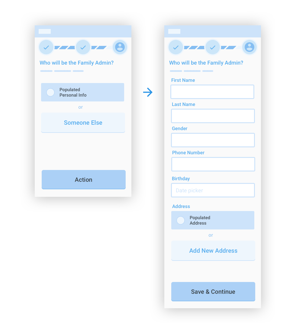
Since I couldn't cut back on the data needed, the next solution I explored was allowing the user to reuse data that had already been submitted. It was common that the purchaser of the GrandPad would also be the Family Admin, and in rare cases, the GrandPad user would be purchasing it themselves. Based on this information, I felt comfortable having the primary form action being selecting previously inputted data, while the secondary action would be adding new data.
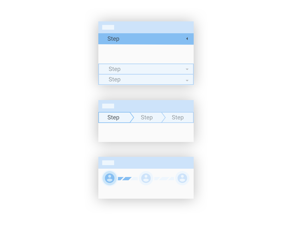
In the case that a user could not re-use data for any of the people or addresses, I still wanted a way to make the process feel quicker. The current version had a progress bar at the top of the page, but it was a solid green bar that incremented at seemingly random levels each step along the way with no indicator on how much many steps were left to complete.
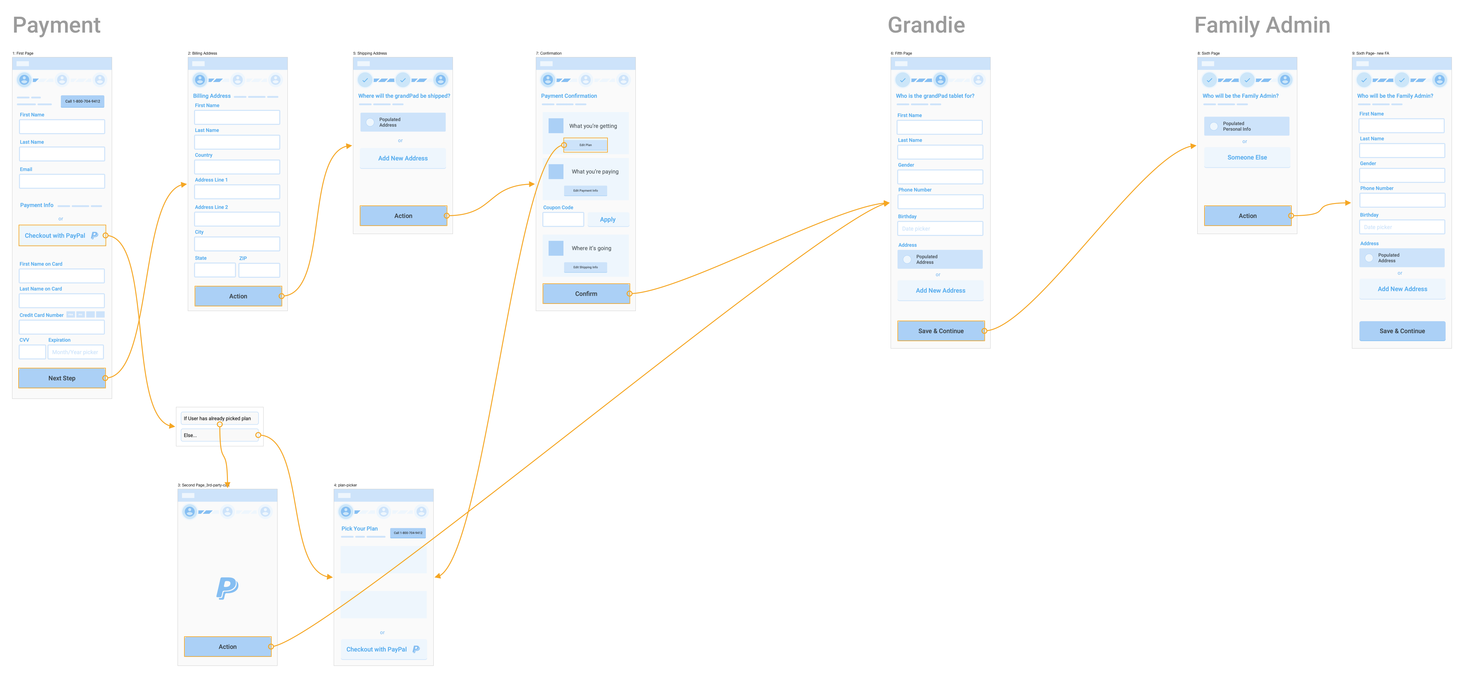
I internally tested a few wireframe navigation patterns to see which best informed users on their progress: Collapsible sections, breadcrumbs, and an updated progress bar. Collapsible sections for steps allowed users to quickly go back and forth between steps but seeing the names of all the steps felt too heavy and overwhelming to the user. Using a typical breadcrumb pattern had similar problems, and didn't scale well to mobile with the step names listed inside the breadcrumbs. The updated progress bar used icons to show the type of data being collected and broken lines to indicate the steps for each group. This option provided users with just enough information about their progress without overwhelming them with the names of all the steps left.
Testing
The first flow I prototyped and tested collected only the name and email on the first step so that enough information was grabbed for marketing to work their retargeting and abandon cart magic.
I explored the idea of integrating with third-party checkouts like Paypal or Amazon to save the user some time on inputting their payment details. After we had already tested the flows, we realized our shipping process wouldn't work with these types of services. So although the option is in the wireframes, it didn't make it to the final experience.
Flow v1
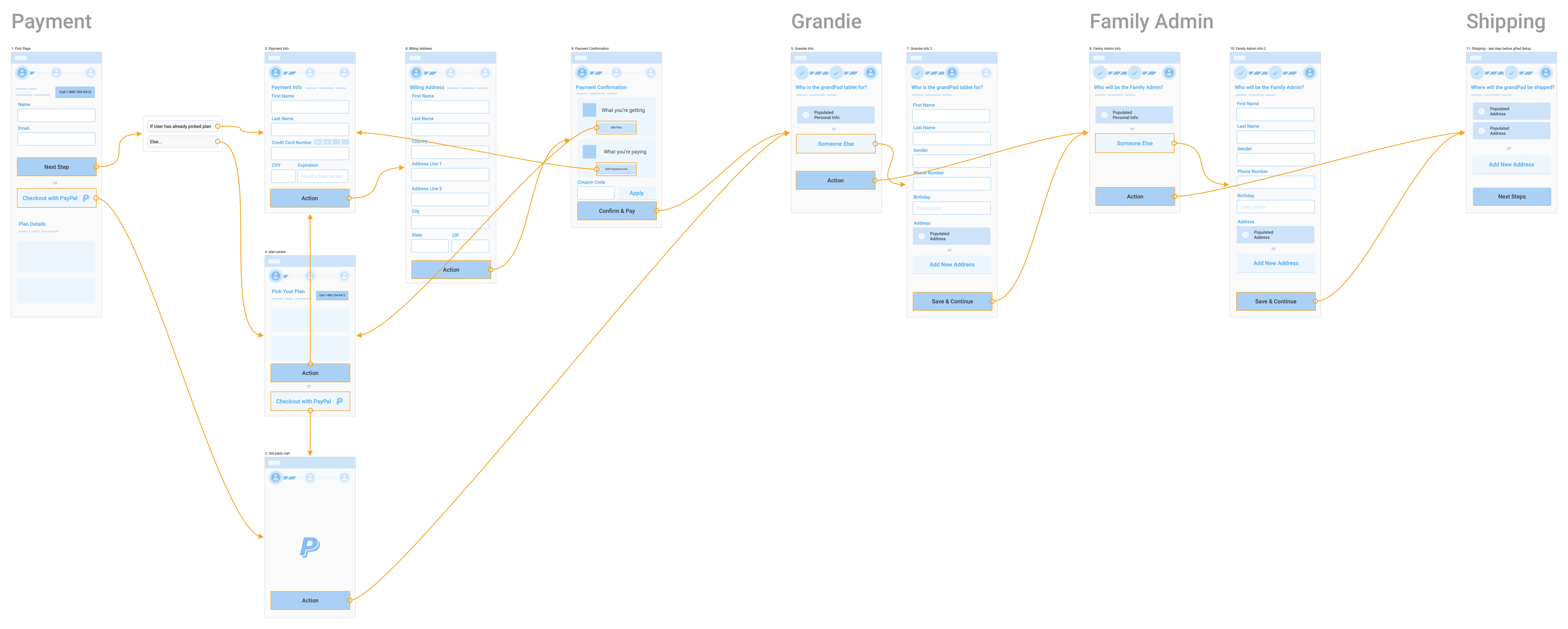
The next iteration of the flow I tested grouped name, email, and payment information on the first page. Since a majority of the users were coming from the product info page of the website, they had already expressed their interest in purchasing a plan by clicking on its corresponding buy button. I figured we could hide all of the marketing about the different plans unless the user had not chosen one yet, which in that case picking a plan could be the second step. This helped cut one more step out of the process.
Flow v2
I created a prototype to be tested on mobile phones since the amount of data the user had to input was going to feel like more on a small screen. I used one of the more popular small device sizes, 320x568, to do a quick test on how much scrolling would be needed on each page of the flow to get through the checkout.
Scrollable prototype with clickable buttons at the bottom of each page
Note: Once development started, we found out that to create an order we first needed a name and email address before we could assign payment info to the order. The experience we shipped ended up having only a name and email address collection form on the first page, but to avoid adding another step to the flow I combined the payment info and billing address into one.
High Fidelity Mockups
and Interactions
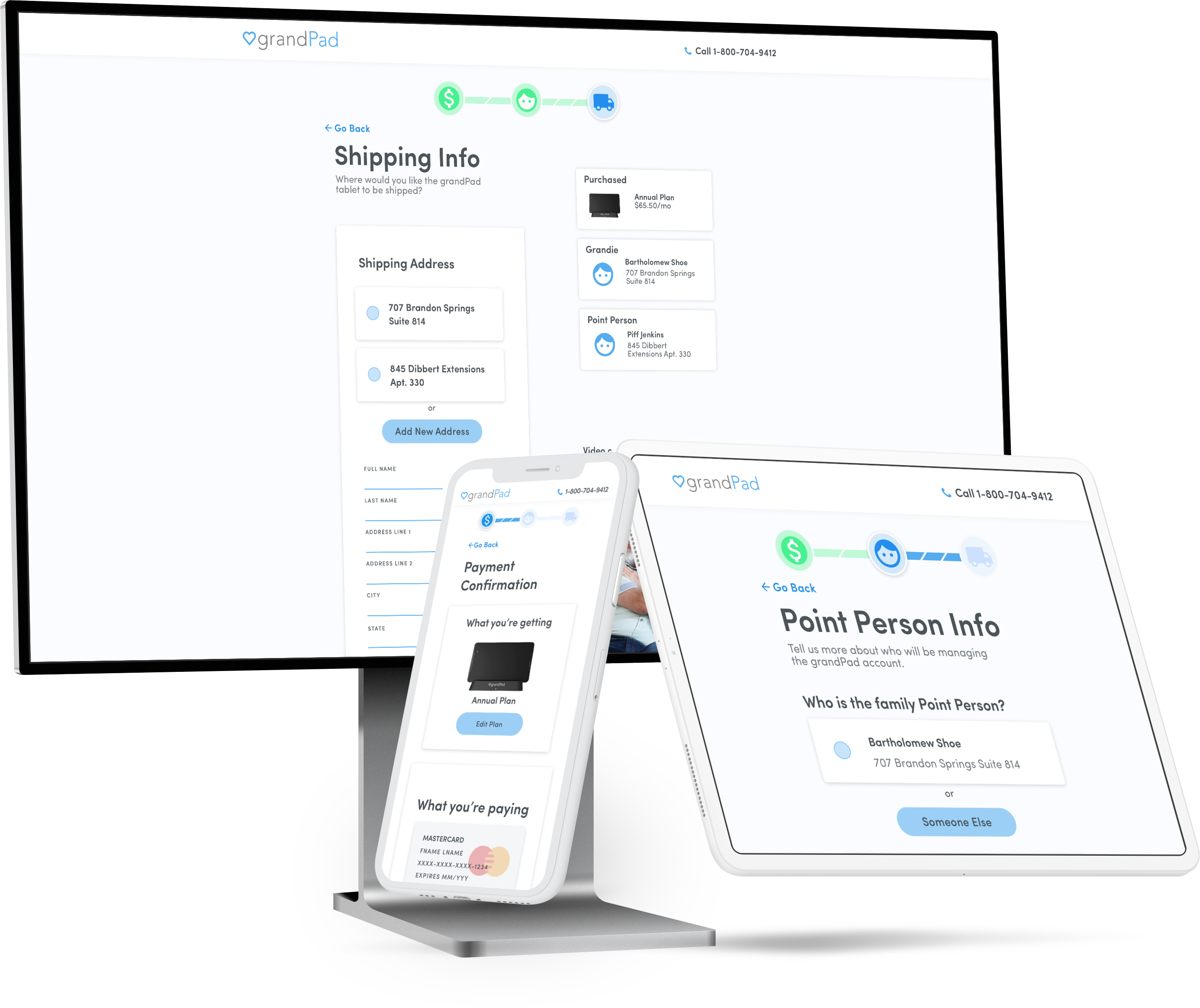
Now that we had a direction to move in with the flow of the checkout, it was time to put the polish on the mockups. I followed the same base for UI styling I used in the main website redesign: large and bold type. This played an important role in ensuring users felt secure in making their purchases.
Because the user had to make a payment before entering in the details for the setup and shipping, I made sure it was clear that their card was about to be charged. Instead of the blue buttons used in the rest of the flow, I used a bright green color with the text "Confirm & Pay". This way the users would know that the payment would be processed before the full buy flow was complete.
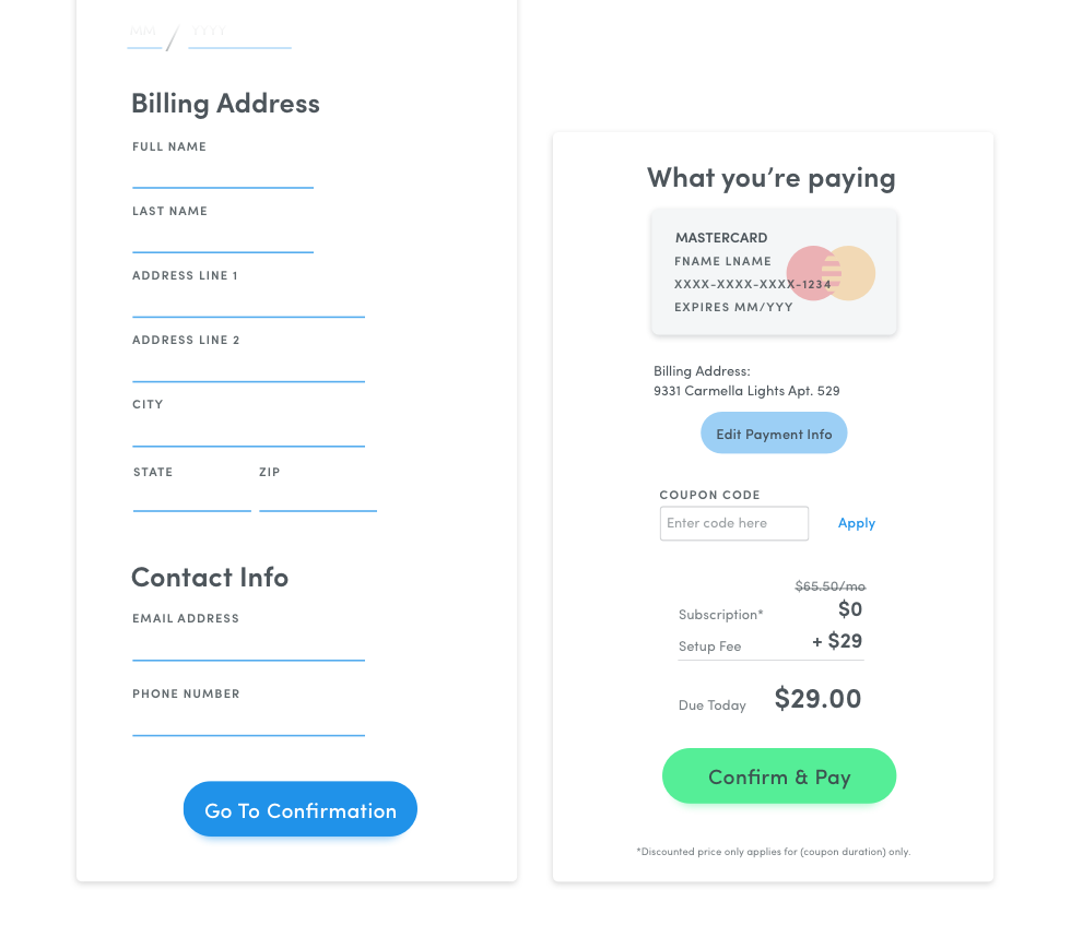
Another detail I used to bring confidence to the user was small indicators with details of what had already been input, as well as when the purchase had been made. These only appeared on the desktop version, as they were nice-to-haves and didn't fit well on mobile.
After that, I prototyped the interaction for showing and hiding inputs for when a user was not reusing already saved data. Nothing too fancy, and something easy to implement in code.
Implementation
Me and one developer worked on the implementation together for a couple of weeks. He worked on the backend PHP code to get the correct data showing on the pages, and from there I would handle the layout and styling in HTML, CSS, and JavaScript.
Results
We launched in time for the marketing campaign, and the redesign was well-received by our team, customer experience, and the marketing firm. Customer experience also pointed out that they were getting fewer calls about the buy flow after we launched.
Sadly, the new site didn't stay up long enough to get significant data for comparison to the metrics from the previous version. Shortly after we launched the redesign, we partnered with Consumer Cellular, who was going to handle all sales through their website.
Takeaways
One of my biggest lessons from this project was how to deal with unforeseen snags during the implementation process. When finding out some features or flows couldn't be accomplished due to development or time constraints, it was tempting just to fall back to the way the old version was because we were already set up to support it. Finding compromises in the middle of what was intended and what was possible only required asking the right questions and having good discussions with development. I've found that knowing a bit of code makes me much more empathetic to developers' concerns about implementing a design.
Another lesson from this project was learning to realize that a product you spend a lot of time and effort on to launch may only be in production for a short while. While it is arguably better than a product never seeing the light of day, it serves as a reminder for me not to get too caught up in the long-term vision or timeline.